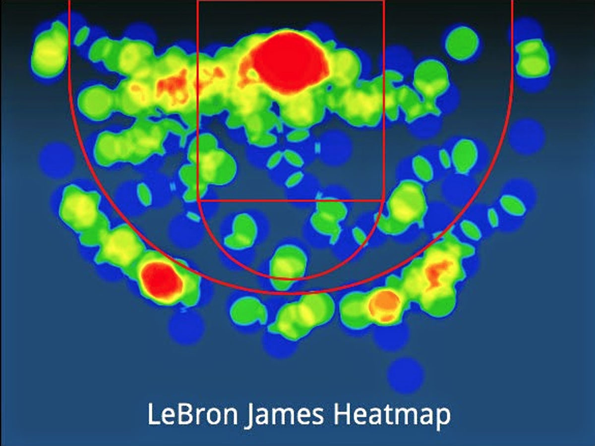
Those interested in the "hot hand" and sports streakiness should check out NBAsavant.com. It's an easy-to-use, addictive data visualization site that generates charts and heat maps of NBA players' scoring.

Data visualization, an indispensable tool of science and business, is a double-edged sword. The human eye (and brain) are good at spotting patterns and trends in noisy data. They are often better at this than algorithms are. That's the premise of CAPTCHAs; it's why people keep seeing "alien artifacts" in rover images of Mars. The problem is, the human perceptual system is too good at pattern-finding. Sometimes perceived patterns are only mirages. (Below center right, a "perfectly round sphere" recently imaged on Mars.)

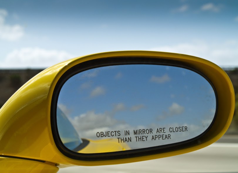
This phenomenon is good for bookies. When sports fans think they can predict winners with a little data visualization (but really can't) that boosts business and profits. But in science it can lead to bad conclusions, and in business to bad decisions. Maybe data visualization tools ought to come with a warning like those on rear view mirrors: PATTERNS AND TRENDS MAY BE LESS SIGNIFICANT THAN THEY APPEAR.